If you haven’t read the prior post “The Weather”, please start there.
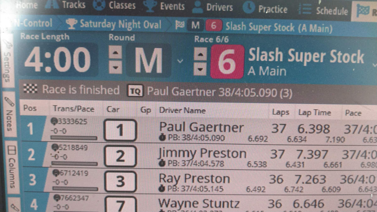
This post covers race data… that is, factual race information that should or could be in your patter as an announcer. Because LiveTime (LT) is the dominant scoring software, that’s what I’ll be focusing on. However, if you use another program it should have at least most of the same information available from somewhere. Obviously we’re focused on the Racing screen, which looks like this (forgive the horrible pictures, and that’s right… I did hunt around until I found one that shows me winning!):
The first thing to note is that you’ve got extensive control over the information displayed for each racer. The “Columns” tab down the left side of the screen brings up a long string of check boxes that make various columns and information visible or not. If you are new the LT, every couple race days you should bring up the Columns window are take off data you never use, adding something else in to see if it’s interesting in your calling. Everyone will naturally have their own preferences for the information they put to use.
Because a lot of the data is about time – time in the race, time between cars, and so forth – how you describe time is important. Some time data is presented to the second while other information is to the thousandth of a second. Describe time in whatever way is most relevant to your audience. Round it off, chop off digits. Shorter time statements are more understandable than longer ones. If you are busy calling 26.742 and 32.268, everyone is REALLY going to tune out because they cannot listen to all of those numbers and retain any sanity. For time in the race, round it off to the nearest minute, half minute, or quarter minute… say “four and one half minutes left” instead of four minutes twenty-eight seconds left”. I literally think you should NEVER say any time remaining that does not have seconds value of 0, 15, 30, or 45 unless you’re counting down the final seconds of a race. For lap times and gaps, use your judgement. If two cars are separated by 4.826 seconds, say they are 5 seconds apart. If the time between is 0.035 seconds, say three hundredths of a second! With an exclamation point. “Three hundredths of a second” is far more easily heard than “point oh three five seconds”, even if it is less accurate.
Some race data is in the “must use” category. You’ve GOT to provide race time information, especially for nitros in races that require fuel stops but all racers like to know how much time is left. My personal format is to call the time down and time left… “4 minutes gone, 1 minute left”. The other required data is the running order, which is generally the order in which LT displays the entrants in this race. LT does a _pretty_ good job of displaying the racer list in the order they are currently running. It’s takes a while to sort down a racer who has broken out, and ideally you will pick this fact up earlier than the software using the progress bar below each entrant’s transponder number. This will turn red when a racer’s current lap goes longer than their current average lap, which _might_ mean they’re off the track.
You can consider everything else on this screen additional information, optional to include in your patter. There is a wealth of data here, and you can fill time with as much of it as you’d like. As I said somewhere earlier, the more you talk the more interesting the racing will seem… even if what you’re actually saying is not that interesting to the average listener.
Before we go through it, I also want to remind you that in general no one is listening. You should develop your patter in a way that helps individuals clue in and listen when something about them will be said. Say their name. Tell them what data you’re about to give before giving the actual data… say “there a new hot lap, John Doe on 15.87!” instead of “15.87 is the new hot lap by John Doe!” Everyone will also typically tune in once they realize you’re saying a list of names, listening for their own.
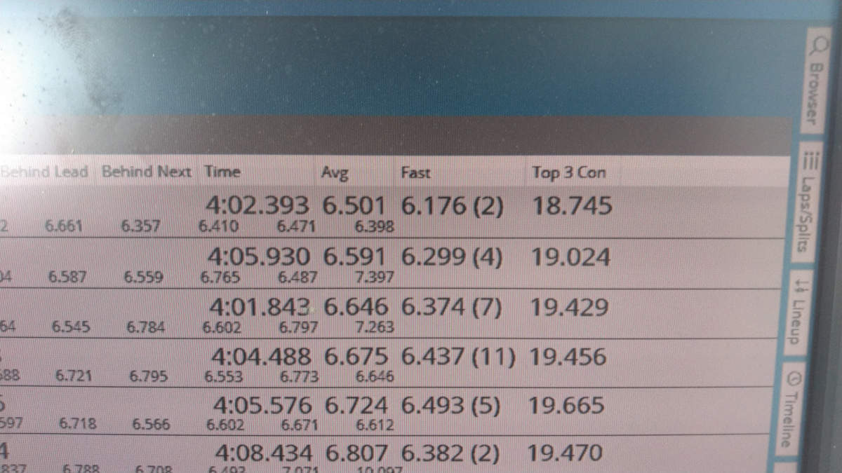
The top optional information you should call is time between cars. Every driver sitting in third wants to know how far they are from the second place car and the fourth place car. This gap data is presented in the column Behind Next, the time between the car in that row and the car in front of them. If you read down the list, you read the name in row 1, the Behind Next in row 2, then the name in row 2, and so on:
Your leader is John Doe, 1.2 seconds to Jane Smith, two tenths of a second ahead of Jake Blake in third…
This style of patter breaks things up by changing the format a bit, including the overall position every other racer and changing the specific wording a bit. No need to sound like a robot. You’ll also use this column to identify close racing, because you want to talk about heated battles. Even during IFMAR qualifying when it’s impossible to spot close battles by simply looking at the track. LT highlights the racers who are quite close to each other using a green or red bar connecting their names on the left side of the screen to help you quickly location these opportunities. The closest racers are highlighted, and that’s always good data to patter about.
Adjacent to the Behind Next column on my screen is Behind Leader. This column is much less useful, with one exception. In a very tight race, especially among the top contenders, a really good piece of data is the Behind Leader for the last car in the tight group. This will tell you, for example, that the top 5 cars are within 1.5 seconds of each other. For tight groups in the middle of the list of racers, you’ll need to do math in your head… either by subtracting the group head’s Behind Leader time from the group tail’s Behind Leader, or by summing the Behind Next for every car in the group except the group head.
Individual drivers are interested in their own lap times, but not the lap times of other people. They are particularly interested in their best lap in the race, and when that lap time is improved. These two columns are Lap Time on the left for the most recent click and Fast on the right for driver’s best lap. Everyone is generally interested in the “hot lap”, the overall best lap of the race. This lap is highlighted in the Fast column, and when a new hot lap is turned LT highlights it in the Lap Time column as well. When possible, call it out when a driver improves their best lap. You should try to call out new hot laps every time, or nearly so. You can also use Top 3 Con in a similar way. This field is the time of the racer’s 3 best consecutive laps.
As the race winds down, the column Avg can become important. If a driver it approaching some milestone – TQ, personal best run, getting onto an additional lap – you can use Avg to provide additional information. For example, if a driver needs to pick up 0.3 seconds to take the TQ and has three clicks left, you know that they need to gain 0.1 seconds each lap. From what? Their average lap time, in Avg. If this driver’s Avg is 15.9, they can take TQ by beating 15.8 in each of their final 3 laps. This is especially useful to you if there really isn’t anything else interesting to patter on, and the driver will appreciate the information you provide.
We should always looking for ways to stroke racers… to talk about them in a positive way. To this end, I strongly recommend replacing Class – useful only when you’ve got drivers in two different classes racing together but counting separately – with Personal Best in the space under each driver’s name. Personal Best (or PB) is the laps/time of the best run this driver has ever recorded on track (layout) in this class. It’s great patter when you can tell a driver that they are current 4 seconds ahead of their personal best, or that they just upped their personal best by a lap. They love it, as it speaks directly to improvement.
The rolling laps history for each driver is presented in the small digits under most of that driver’s row. The sub-row presents the time for each of the most recent 9 laps. It’s useful for identifying fuel stops, periods off the track, and missed clicks. As patter data, you can look here for information. A quick assessment might let you say that the leader is turning laps in the mid 15’s, while the second place car is turning mostly high 15’s (this may or may not also be clear from the Avg column, which is effected by unusually long laps). A driver might have turned five straight particularly good laps, and you can see them as the last five records here… worth mentioning!
There are three vital pieces of data at the top of the screen that I haven’t covered, and although they’re obvious I feel the need to mention them for completeness. The Race Number is highlighted with a block of the class color, and most racers will track their own participation by race number… so they need to know what the current race is. The Next Race is also up here, if there is one. If the class of the next race has multiple heats, you’ll see that in this data as “(1/2)”, which means the next race is the first or two heats. Both of these things should be called at least twice in a race. The TQ is up here too, as “person: laps/time”. You should say this in your race intro, and probably again in the wrap-up. If a driver in the current race has a laps/time that beats the current TQ, a little TQ badge will appear to the left of their name in the Trans/Pace column. Every driver exceeding the TQ run will have this badge, so it doesn’t mean they will BE the TQ.
Finally, let’s talk about qualifying position. One of the most important things for a racer during qualifying is how their current run will change their qualifying positon, especially in classes with multiple heats and mains. A pop-up pane from the right side is good calling data during qualifying for any class that has multiple heats: Estimated Position. This presents the full list of the current class, IF the current racers finish with their current estimated laps/time, and it gives you the sorted list with current racers highlighted. Each driver also has a delta value… the change in their qualifying position if the current race finishes as projected. Be very clear that this data is conditional. Race estimates are based on each driver’s average lap time, and that changes as they do better or worse, wreck, and so forth. You say:
If John Doe finished on this run he will move of four spots in the qualifying order, into fifth.
John Doe is currently showing fifth overall based on this run.
Both of these statements make it clear that we are projecting possible results. You can also add the column Position (I’m not actually sure of that name, because it doesn’t show on the completed race screen I took a picture of) to your race screen. It will show up on the far right, and display the racer’s current ESTIMATED position and their delta (+/-, gain loss based on this run).
That’s the race data. If you cannot find things to talk about from all of this, time to read it again! When starting out, focus on three things: race time, driver position, and time between drivers. As you develop your patter, drop in best laps, hot laps, and so forth. Soon, you’ll need to speed up your patter to fit everything in.
You experienced folks, what data do you like to talk about? Have any cool patter patterns to share?